Thursday, January 28, 2010

My latest 3Ring Circus

My work decided to get back in fashin with how they used to present the Top Producer awards. In the past they had made the brokers into famous album covers, movie characters with academy awards, and classic paintings. This year we brain stormed and thought Circus characters would be fun, and appropriate for the brokers this year.
We spent about a week and a half on the development and design. We had to design the background graphics in a way we could utilize them for several looks, extract the characters from their background, and photshop the brokers faces to the character, then put them all together and figure they Title nad type art. I had to work through this past weekend to get all the posters done in time. Ug, not fun.
At the meeting however, the brokers really enjoyed them, and we got a lot of complements on them.
So without further adu,


Wednesday, December 30, 2009

Paintings and Sunsets

Starting to work with the musician art I made for my box paintings, but this will eventually be done on 2 paneled plexiglass. This was donted for a fundraiser.

Painting over an ancient lotus patining I did while in college that I never finished. I threw this together in about a day. I wanted the body to be a bit more transparent, should have done less middle tones and mostly highs/lows.

Both of these were actually taken in Palmdale or on way to palmdale.


Friday, December 18, 2009

Meg's Holiday Card


A holiday card I made for Megan and family, converted to web animation.

Monday, April 27, 2009

Watch Now - ALBUM DESIGN FINISHED!!!!

Well finally, after about 2 months in process (with many weekends off mind you), Jozef and I finally sent to print his album. It sure was quite a feat working with someone who is on a differ4ent continent, and half a day ahead of you.
We started off with 3 design directions. After some input on what he was looking for and photo requirements, I had an idea that I thought worked really well. Also he changed the name of the alnum to something much better too. Then it was just a matter of getting the info from him, which at times did not come through clearly.
But I think what is the final result definatly represents some aspects of his music. One of the most difficult parts was making it so it was something that would fit in with his music genre, and and visually publish him accuratly. I think this was difficult because I wasn't really familiar with his music scene, to know what others are doing. But thats ok, cause his isn't going to be like anybody elses!
It was funny too, this weekend we were really wrapping things up, correcting small things and edits. I had done the layout of the album at my work computer. The background and images I did at home. Trouble was, the program that I created the layout in was not compatable with what I had at home. Also as an easier way to edit the small things, we figured I can just send the working files to Jozef and he can make any small edits.
Well, never having worked with one of the top of the line publication design programs, it can be like painting amasterpiece in the dark. But since I am such an 'expert' in the program, I could tel him what he needed to do and where to go even without seeing the work.
Then after he got everything generally in place, it was 2am for him, so bedtime. He sent me what the file was like, so I could check it out. Lets just say the type was not to my liking. But its not his fault, just needed some font substitutions. Once he took care of those, he was going to head off to the printer. But I needed to see them before he went to the printer. That time would be afternoon for me, while I am still in dream land. And sure enough, a ring-a-ling comes in at 4am. I didnt mind though. If my nameis on it as design and layout, Ill do what ever I need to get it to my approval. So with just a little but of edits, he was ready for the printer.
And without and further adu, here it is. (BTW, the case is a paper jewel case with a clear cd holder. )
Cover
Interior spread- cd will go over collage. Click for bigger image.
Back
CD (obvuiously). The type color is different on the final. Thats a fish head on the cd that Jozef took a pic of in Alaska that he asked me to use somehow.
Well, thats it. I am really relieved that it is finally done, and the way it turned out. My first cd design, yeah!!
He says it should be printed and ready near the end of May. So keep your ear open, and SUPPORT YOUR LOCAL/FAMILY MUSICIAN, BUY A CD!!

Wednesday, March 18, 2009

Invitation finIshed!

You may have read my publish the other week about a project I was working on at work with an event invitation. Well we finally finished most things envolved with this. The idea for this invitation was that it looked like a medical file. The event was at a medical park, and was catering to dental and medical professionals. Practices who would be needing office space and included information and benefits about owning your own office space, with any sort of information your may need to get your office going is to be presented and discussed.
The printing specs of it were pretty simple. We had the cover printed on a stock that is the same as a yellow file folder (it was the size of any regualar birthday card) and we only printed on the inside. We printed the inserts in house.
That included assembling 4000 invitations, ahhhhh! That amount is just obscene, rediculous and wasteful. I tried my hardest to get them to stay with 2000 pieces. But the client decided since it costs the same to print 500 as it does 4000, they figured go big.
At first I didn't think that the assembly would be bad, after all its just a wrap and two pages clasped together inside. But, you have to stuff them in and envenople that also needs to be addressed. There were so many steps involved actually. It was fairly easy to get the two pages together on the inside of the invite. But he wrapping took a bit more time. The wraps needed to be folded before they went on the invite cover, and then glued with a quarter inch tab, with a glue stick.
We ended up have a few different assistants teaming up each doing a different step. It took us 4 days to get them all completed and a total of about ten people worked on them.
I included the digital files, and a couple photos that I just snapped on my desk here with my iPhone.


Friday, February 6, 2009

Meet the Experts

I have a project at work that is an invitation for an event. Its for a medical building specialty event. So I picked up the job and started away. The deadline for the first item, and ad came around super quick. The week that a coworker got laid off, so we were trying to pick up the work she slacked on not doing cause she knew she was getting canned, ont top of everything else we had to do. But I designated time and told people what schedule they could expect, and gave almost a solid day to getting the ad done.
Its a lot that had to do, because she wanted a logo they coud use for the event, and this ad was obviously supposed to tie into the invitation that would be soon following.
The logos that I quickly developed I thought were pretty cool. The weekend before Ihad done some thumbnailing/conceptualizing so I had and idea what to do when I started on the computer. Then ba-da-bing within a couple hours, busted these fellas out.


The builsing is designed with a certain natural aestetic, so I thought to keep along those lines, sort of. That plus medical professional. This weekend I have to figure out the paper and style and all the exterior features that we might go with so I can start the design next week.So soon!!

Wednesday, December 10, 2008

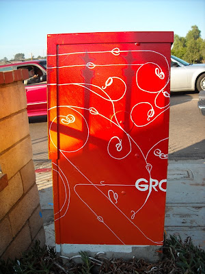
SEDC electric box

(I posted this on my general blog, but should have put it here. So to make it right, Ill double post it)
Well here it is! This is the electric box that I painted. It was in a interesting location and position. A couple things changed regaurding the box since I originally drew out the design. First off, I wanted to do a large one, because thats a grand, small ones are only 500. The category I chose from was to be dedicated to a certain range of streets. All the large boxes were painted here, so thats why I got a small one. So because of that, i down geared my effort involved. Also because of the location of the box to the gate right next to it, and the shrubbery that was around it really interferred with my original design. Because one wall was now mostly obstructed, I wasn't going to paint much on that, but my design worked and flowed between 4 panels. So I adjusted my image so the kids instead on being in the middle of the square, would now sit on the corner. Also shifted my entire design half a square over to move along with the kids reposition. Also I only painted one kid as you can see.
Painting the tree, leaves and objects took the most time. Mostly it was gettting used to the viscosity of the paints. The Leaves were fun to paint once I got used the the paint, aI could do a leaf all in one stroke. That part took about 4 hours. The background I busted out in just under 2. For the lines I found these enamel paint pens. They worked much better than what I would have had to do with a paint brush. Could have helped my pinstripping skills though. So all together I guess it took me about 8 hours to paint it. I think it turned out nice. Really different from what you most often see on electric boxes.
Oh, the idea behind my drawing was chosen from the category Inspiring education. To me that is from nature/life and technology and the connection and integration of nature/organic and technology. So I have a child reading by a tree (tree of knowledge I suppose) and there are basic education building blocks things included in the tree. Also items that help with education that are technology, like computers, calculators, microscopes etc. The tree change to a more technical look, showing a sort of symbiosis between nature and technology.


you can see on this one the label that I had to keep clear because SDGE needs.


>
Here is my original drawing.

Friday, October 10, 2008

New work event project


Since the company is not having a Christmas party or other normal events that we have, were combining a couple events in one. Last year, we had the olympics. This year after having a good success when we had a putt putt challenge, went more along that line for this years event. I wanted to make the poster more fun and like random office doodle from a meeting or something. That way it might motivate people thinking this will be a pretty cool thing.
The original version I had, had challenge in 2 lines, chall-enge. This made a better shape and format for the 'logo' and also fit better on the page. But, I had to adjust that from the censors.
I think it turned out alright. I wasn't supposed to take too much time, so I only spent one day on it. And half of that was trouble getting the pics from my camera. Technology is great, when it works.
Email version

Posts from Rachels Ramblings


For more information, see blog posts:
Cool New Projects March 03, 2008

West Coast Tree logos April 2008